Stop-discrimination
![]()
Hoet&Hoet signs the new campain of the Centre for Equal Opportunities and Opposition to Racism
The Centre is a public institution that aims to promote equal opportunities and that fights any type of exclusion, restriction or preferential treatment based on legally stipulated criteria. The Centre also oversees the respect of the fundamental rights of foreign nationals and observes the nature and scope of migration flows. Furthermore the Centre stimulaties the fight against human trafficking.
Sonuma

Constituted on January 8, 2009, Sonuma has as objective to digitize the production of the public channel RTBF but also to take care of its marketing.
The missions of Sonuma are centered around three paramount concepts:
– the patrimonial responsibility by safeguarding a the audio-visual memory
– the alliance of the technical expertises, documentary and editrorial to preserve and diffuse the files
– the development of various services bound for the professionals and the public.
For iU

Hoet&Hoet designed the new identity of Equiform and rebranded the name into a very personnal ‘iU’.
iU. It is to propose the right answer to the right person, in a place of experiment, discoveries and pleasures; with the advices, products, prevention, solutions, protection… It is to bring greater comfort and to develop, in a durable way, the capital beauty and wellbeing…
H1N1 visualized

Information is beautiful when understood. This diagram from David McCandless is even helpful.
Animal Logo Jungle

“As we are surrounded by logos, we are systematically invited, encouraged and directed in what we do. Brands want to be personal and engage in a relationship with you. They want to become a central part of your life. But there is no dialogue, only targeted one-way communication. The symbols are constantly in your field of vision but they are still not part of the public domain. Ownership is of the corporations and the destiny of the logos is in their hands.”
Karl Grandin
Type Radio

Typeradio is a Microfm broadcast, a MP3 internet radio stream and a podcast station.
Since 2004 Typeradio (which is Donald Beekman, Liza Enebeis aka LoveLiza & Underware) is visiting different design events around the world, to meet designers and to talk.


Branding and rebranding
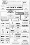
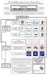
The Handy Reference Guide to Corporate Identity by Tibor Kalman and the revised one by Bryony and Armin.
Shape vs. Color

“The brain acknowledges and remembers shapes first. […] Color is the second in the sequence. […] The brain takes more time to process language, so content is third in the sequence behind shape and color.”
– Alina Wheeler, www.alinawheeler.com
“Angela Wright, a colour psychologist at agency Colour Affects, adds: ‘Colour is noticed by the brain before shape or wording.’ […] The mind absorbs colour before design or wording and it is estimated that as much as 90% of the information taken in about a new brand is related to colour.”
– Ruth Mortimer, “The Colour of Money“
20 Corporate Brand Logo Evolution

Have you ever wonder how the first Apple logo looks in 30 years back? Did you know Volkswagen was Hitler’s idea? Or how the IBM logo changes over the time? Or where the Mercedes-Benz Brand And The Three-Pointed Star logo came from?


leave a comment